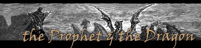

Mr. Cavin, who I trust on matters of design, suggested I add a black bar and reverse out my name so it wouldn't get lost in the background. A solid bar looked clunky, but I tried some wave filters and came up with this. I took out the word "stories" since it was mostly empty calories; people can read the description and discover it's a collection. It does seem nice to have my name more prominent. Anyone have any strong likes or dislikes to this version?
3 comments:
This is the kind of thing that I would never spot, but seeing this cover next to the previous version, it seems obvious to me that the change was needed. I like it.
Thanks Sylvia. I just uploaded this version to Amazon. Hopefully it will be live by morning. It's just another advantage of epublishing that you can tweak stuff like this on the fly!
I definitely like this newer version better.
Post a Comment